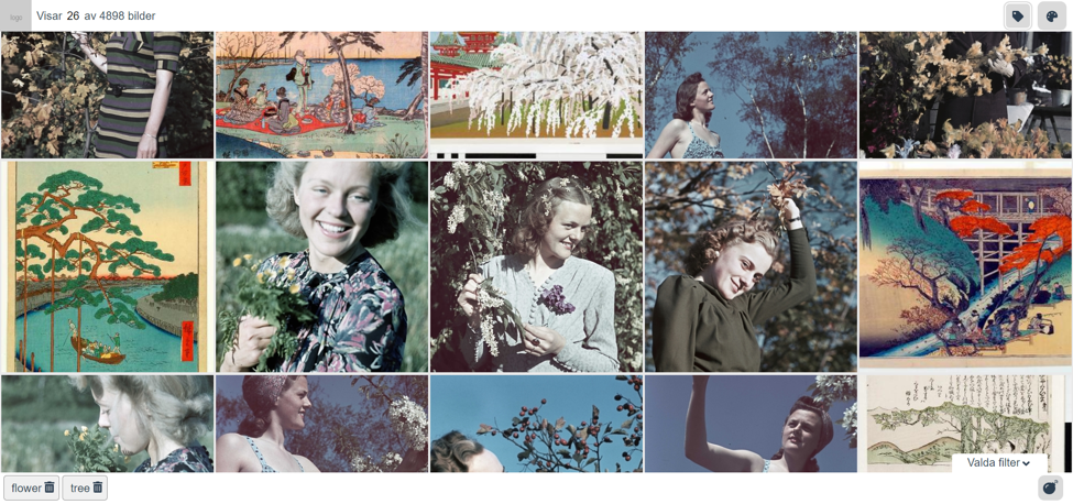
Issue 11: Generous Interfaces
EuropeanaTech Insight is a multimedia publication about R&D developments by the EuropeanaTech Community
EuropeanaTech Insight is a multimedia publication about R&D developments by the EuropeanaTech Community
At the EuropeanaTech 2015 Conference in Paris, George Oates took the stage as the final keynote speaker to make a plea to cultural heritage institutes to stop using search boxes. Her observation was that enormous databases that employ standard search do not offer users anything of value. She argued that search based heritage databases do not take into consideration the value of the content itself, the context of said content and its relationship with different collections and thereby diminish the value of heritage collections.
George Oates, EuropeanaTech 2015 Conference from Europeana on Vimeo.
Looking at an empty search box knowing that tens of millions of items reside behind it is intimidating but also exciting. The potential for discovery is endless yet, where does one start? There’s the rub. If and when the user does decide to dive in to explore but do not start finding what they’re looking for after a few minutes they become frustrated and leave.
As Oates remarked in 2015, “humans like to look, we don’t like to search”. She references personal experiences exploring Paris, a city that enables people to enjoyably browse and discover the city's beauty not strenuously search. As a solution she pondered, “is there a way that you can represent your whole dataset that isn’t just a random sample of rows but is actually designed to give the person who wants to work with your data, a taste of it before they download 7GB of RDF?”. She’s not asking for detailed curation that segments a collection down to its barebones, but a large scale method for presenting large collections in a browseable, engaging and intuitive manner.
Just several years prior in 2013, Professor Mitchell Whitelaw at the ICA Congress in Brisbane Australia made the case for a concept he called “generous interfaces”. “Generous interfaces offer rich, browsable views; provide evocative samples of primary content; and support an understanding of context and relationships”. It’s a term and practice that is becoming increasingly popular in the heritage sector and Whitelaw was invited to present his work via videolink at EuropeanaTech 2018.
His presentation seemed like a response to Oates’s pondering. Diving into the world of generous interfaces, Whitelaw made a clear case and provided numerous examples showcasing how generous interfaces work and their added value for institutes and collections.
For this issue of EuropeanaTech Insight we dedicate three articles to generous interfaces and several institutes putting them into practice. The authors discuss their reasonings as to why they’re using them and the impact they’re having on their users and collections. As heritage databases continue to grow and become more connected through Linked Data and the semantic web it’s imperative that we present heritage material in a way that benefits the users and not subject them to “stingy” interfaces as Whitelaw calls them. We hope this issue of Insight will inspired others to adopt these practices and change the way users discover heritage.
Lastly, these are just a few examples of institutes putting generous interfaces into practice. If you or your institute are working on similar projects, please get in touch, we’d love to share your work and your experiences with the rest of the EuropeanaTech community and continue to learn from one another.
Visualising cultural data can be really powerful. Data visualisation (using visual representations/mappings of data to show patterns, trends and anomalies) can support analysis of digitised collections for research and administration, support communication and display, and also exploration. Visualisations as exploratory interfaces can show and reveal; their aesthetic power offers a rich browsing experience; they can enhance contextual detail, showing connections across datasets; and can offer multiple views through interactivity. As digitisation levels across the cultural heritage sector continue to grow, visualisation can be a valuable tool to help make sense of increasingly large and interconnected datasets. A growing number of cultural visualisation examples now stretch across a spectrum of designs (Windhager et al., 2018).
But a powerful, meaningful cultural visualisation does not necessarily have to rely on complex graphics. My colleagues at Royal College of Art, London and I work on timeline visualisation of cultural datasets (Kräutli & Boyd Davis, 2013; Boyd Davis & Kräutli, 2015; Boyd Davis, Vane & Kräutli, 2016) and we have created designs with a number of different institutional collections (see Figures 1-4). Through working closely with curators, historians, and also casual users, the value of simple/minimal design is a point that has come up repeatedly.
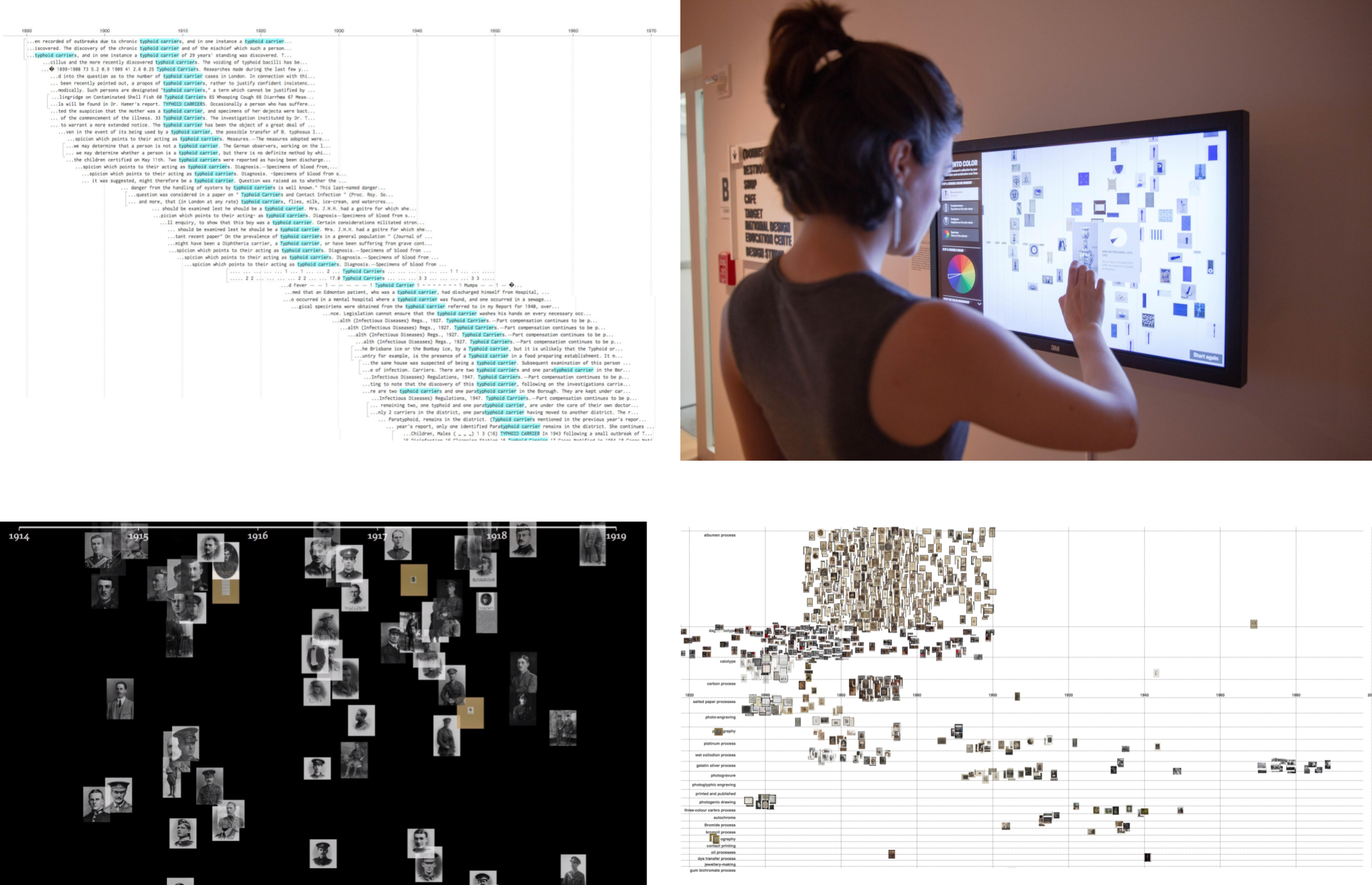
Figure 1: Top Left: Visualisation of Medical Officer of Health Reports, Wellcome Library. Top Right: ‘Dive into Color’, Cooper Hewitt Smithsonian Design Museum. Bottom Left: Waterfall visualisation of Imperial War Museum, London data. Bottom Right: Visualisation of Royal Photographic Society data at the Victoria and Albert Museum. Photos credit, Olivia Vane
The virtue of simplicity has been noted before. Fred Gibbs and Trevor Owens argue that insufficient usability is an issue with many digital humanities tools; a simple and clear interface promotes ease-of-use and transparency. Complexity, in contrast, can increase skepticism. I have encountered similar sentiments in evaluations of my own designs for digital tools. A historian commented to me, while discussing a prototype in development: “I really like the simplicity of your visualisation actually. You haven’t tried to be flashy and sparkly; it’s just ‘this is the information’”. Creating an unobtrusive representation that still assists users sounds like a good thing, but apparently simple designs can conceal tricky intellectual and technical questions.
Timeline visualisation, for instance, is often assumed to be easy and straightforward but, in practice, issues can quickly surface. It is common for date information in digitised collections to be imprecise and/or uncertain (Kräutli & Boyd Davis, 2013). Items can have dates like ‘created before 1870s’ or ‘late 19th–early 20th century’. How do you plot such an item, and possibly many other items with similarly uncertain dates, on a timeline in such a way that is legible and useful, but also does not mislead?
Items can also have multiple dates attached to them. Even if just considering a ‘production’ date (rather than period of use, date of acquisition etc.) the situation is complicated; I have encountered records for objects that are replicas of an earlier original, and photographs with different dates for when the photograph was taken and when the print made. Records for historical buildings can have tens of dates attached for renovations, amendments and rebuilding.
Strategies to deal with these kinds of issues when creating a visualisation will depend on the make-up of the specific dataset and your visualisation design goals. Making prototypes with real data in dialogue with stakeholders/collection experts can progress the design process by both, helping to expose issues and as a way to explore ideas and possibilities.
In a visualisation project with the Cooper Hewitt Smithsonian Design Museum in New York City for example, I was working with collection data where many of the older objects had date information with wide time spans. I developed a strategy for mapping the images in an irregular collage-like way (which I have written more about here). The result (see Figure 5) has a minimal aesthetic, and encourages users to make visual connections and observe trends over time rather than count frequencies or read off precise dates.
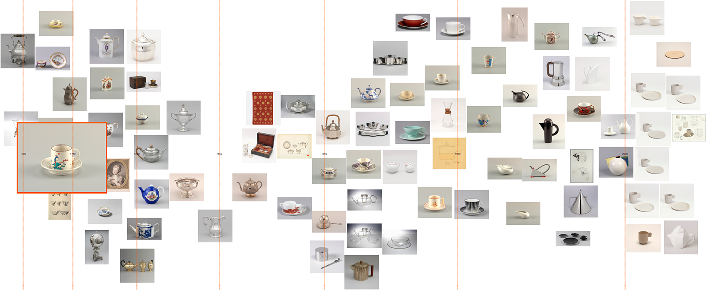
Figure 2: Olivia Vane. 2017. Prototype visualising items tagged ‘coffee and tea drinking’ in the Cooper Hewitt Smithsonian Design Museum collection horizontally by date. The visualisation shows designs in the collection stretching from 1700 to the present with a great diversity of forms and styles, elaborate and minimal.
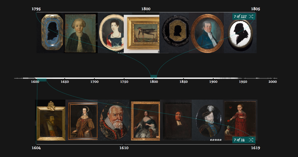
In a different project visualising historical portraits in Swedish Open Cultural Heritage data, similarly many of the dataset items had wide time spans. I was interested in supporting comparison of portraits from different times, while keeping the images large enough to make out. Through trialling various ideas by prototyping, I set on a different approach using sampling (see here for more detail). This approach visualises example images from a period, and images from different periods can be viewed simultaneously on dual timelines (see Figure 6).
Faces of Sweden from Olivia Vane on Vimeo.
The kind of questions that arise when creating cultural visualisations, even with simple graphics, can be very subtle, for example inclusion/exclusion of data. In the same project, the interface design proved productive for exploring changing historical costume through time. The clothes worn by the person depicted in a portrait, though, are not always from the time the picture was produced. For example, this dataset included a number of 19th-century prints depicting earlier historical figures (see Figure 7). Should these be included or excluded? Working closely with collection experts can help navigate these sorts of questions.

Simplicity in design can also be an issue for collaboration. Stefan Jänicke has described a balancing act in collaborative research projects:
I have experienced this first-hand. Submitting a visualisation technique for historical data to a computer-science-domain visualisation conference, one reviewer commented: “the technique is simple and elegant, but that also raises questions as to the significance of the contribution and whether it is even a ‘visualization’ at all”. This issue points to the value of individuals who cross disciplinary boundaries, but also to new difficulties they may encounter.
Simple visuals in cultural visualisation are valuable for ease-of-use, comprehension and transparency/trust in tools. In practice, though, their design can involve practical and intellectual challenges. Prototyping, while working closely with stakeholders and end-users, is a productive way to foreground the issues and questions in a project and, so, develop productive designs.
Thanks to the push to digitise archives and make them searchable online, millions of archive items that previously languished on a shelf have become easily accessible. However, access via search has its limitations. In his discussion of Generous Interfaces for Digital Cultural Collections, Mitchell Whitelaw drew a striking analogy:
It is not only visitors who are new to the collection who find themselves stuck, frustrated, in the drab lobby. Think of the archive manager preparing a pitch to their funders, who needs numbers on how many books and newspapers their archive contains and how the amount of content has grown over the past five years. Or perhaps a project manager estimating the cost to digitise their old video content. Or a scholar analysing the shift in language use in debates on migration. The information they need to properly answer the question is contained in the archive, but obtaining this information via search is typically a long, labour-intensive process.
While the root of this problem is the same as that described by Whitelaw, namely that search is too limiting, the solution is quite different. Whereas a generous interface for a visitor focuses on presenting the archive items in an innovative, explorative manner, a generous interface for answering these sorts of questions about the archive requires deeper access to the underlying (meta)data.
At the Netherlands Institute for Sound and Vision, as part of the CLARIAH project, we have been working on a new type of data access that provides insights into an archive by enabling flexible aggregations of the metadata. We identified three types of tasks that are not sufficiently supported by existing interfaces - overview, investigation and analysis. In our example, the archive manager wants an overview - general statistics about the archive. The project manager needs to do investigation - she needs statistics for a specific section of the archive, to find out how many hours of material on video carriers have not yet been digitised. Finally, the scholar wants to conduct an analysis - for a particular section of the archive, he wants to detect patterns in the metadata, in this case the change in words used to describe migrants.
Each of these tasks boils down to the same essence; a combination of a query with an aggregation of the value of a given metadata field. The query selects the section of the archive that is of interest while the aggregation calculates the desired data. For the example of the project leader, she will search for all items on a video carrier that do not have a corresponding digital carrier and will calculate the sum of the duration of each carrier.
Previously, this type of generous access to the data was limited to expert programmers working for the archive in question. They could pull whatever information they needed from the database. Our approach helps users of all skill levels obtain exactly the data they need, and processing it to get the answers they want. For example by plotting a graph, creating a word cloud or performing further analysis of the data. We use Jupyter Notebooks, open-source software that allows you to create and share documents containing live code, visualisations and text. Jupyter Notebooks provide access to a wide range of available functions created by diverse programming communities, such as Plotly and MatPlotLib to plot graphs and NLTK for language processing. Users with advanced programming skills can also write their own functions.
We have created pre-prepared notebooks that only need to be run to produce a standard set of statistics and visualisations for the Sound and Vision archive. Users can specify their own queries and aggregations by simply changing values in the functions. Metadata can also be retrieved and analysed using third party functions, such as language processing to detect frequently used words. For people who are not at all comfortable with editing values in code or have no time to familiarise themselves with the code layout, we have used Dash to create a simple user interface, allowing them to specify their query and aggregation based on simple dropdowns and other controls, giving them freedom and flexibility without requiring technical know-how.
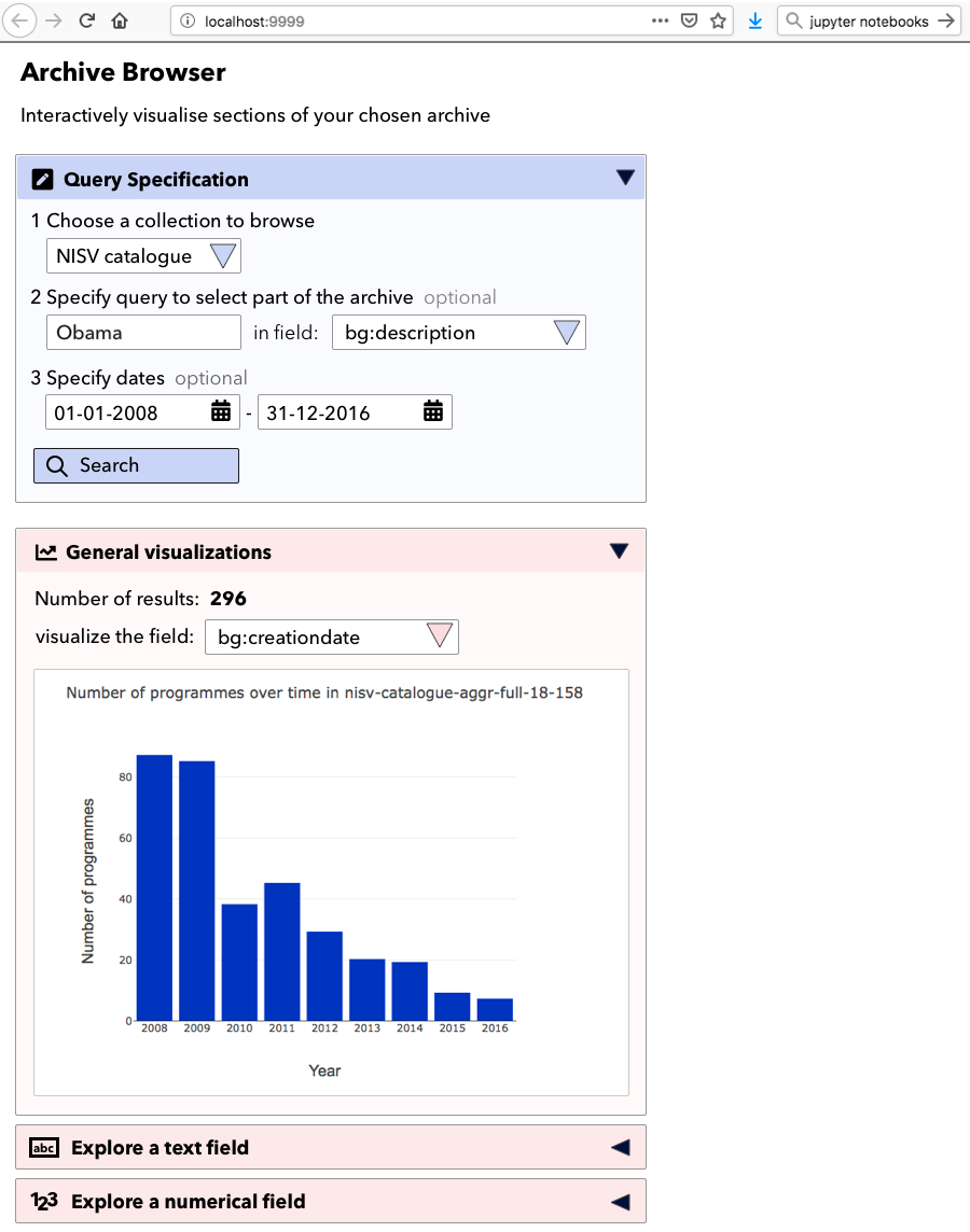
Figure 1
We are currently investigating whether such an interface could be offered as part of our Media Suite portal for researchers. In this way, the same underlying infrastructure is used to support users with a whole range of technical skills.
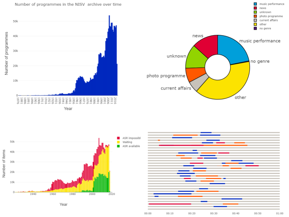
Figure 2: Top Left: Example of a Jupyter Notebook. Top Right: Distribution of items over genres in the Sound and Vision archive. Bottom Left: Availability of speech recognition transcripts (ASR) in the Sound and Vision archive. Bottom Right: Results of matching YouTube clips taken from a current affairs programme (coloured sections) to all editions of that programme (grey lines) in a given month
If such access can be provided using generic approaches and existing software, why is an archive involved in developing this technology? The answer is that archival knowledge is as essential throughout this process as programming knowledge. Selecting the right metadata fields requires knowledge of the meaning of those fields, of how they are filled by the archive, and how that has changed over time. For example, Sound and Vision mostly registers genre information at the level of a television or radio series, not for individual programmes. Defining which part of the archive you need to query can also sometimes require archive knowledge; for example, to correctly estimate the progress of digitisation at Sound and Vision, you would need to exclude the part of the collection that contains physical objects that cannot be digitised. Finally, correct interpretation of the results relies heavily on archival knowledge. A naive observer of the graph of items in the Sound and Vision archive over time would conclude that media production in the Netherlands has exploded in recent decades, whereas the reality is that direct access to the digital output of the broadcasters has made it possible to archive far more of the produced material than previously.
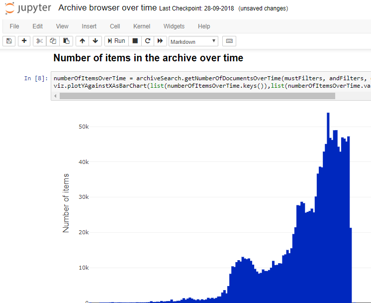
Figure 3
Archival experts and programmers worked together to embed this archival knowledge in all the components of our data access. From ensuring that the basic functions included information on metadata completeness, to selecting the correct fields for the pre-prepared visualisations, to creating a metadata dictionary to assist users, and, finally, adding contextual descriptions to the notebooks.
Data access via Jupyter notebooks has already been used for answering internal Sound and Vision questions, to provide overviews of the collections available in the Media Suite and to support Clariah scholars in their research projects, for example, in matching YouTube clips to the television programmes they were taken from. The next challenge is to discover how we can enable wider use of this data access, by sharing notebooks on a Jupyter Hub, and integrating it into the Media Suite.
For further details, see a selection of visualisations available on the Sound and Vision data website, and the paper we presented at the Computational Archival Science workshop. This approach is applicable to any archive whose database technology is capable of specifying aggregations and queries, and who is in the position to create an API to make these available to users. It allows archive users to escape from the lobby, and discover the answers they are looking for in the wealth of metadata in the archive.
The term generous interfaces was coined in 2015. It denotes a design philosophy for digital heritage collections that emphasises the following principles:
In this, it contrasts with more conventional search-oriented interfaces. While a small number of institutionally developed and maintained generous interfaces exist the majority are demonstrators or prototypes only. So, why hasn’t there been greater adoption? This was basically the question behind the evaluation. Some other questions we wanted to try to answer were:
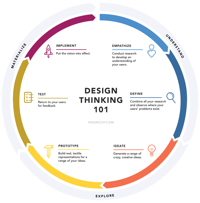
We followed the Design Think approach and more specifically based our method on the Google Design Sprint. The approach and method emphasises quick full iterations (see figure x below) performed by a cross-disciplinary team. In our case we need to adapt and simplify the designs sprint so that it could be carried out in 3 rather than 5 days. To compensate, we did a lot of user testing in between sprints (and of course a lot of software development).
“I hear and I forget,
I see and I learn,
I do and I remember.”
Xunzi
We went through four such design sprints to create our colours and tags-based exploration interface. A fifth sprint was dedicated towards a retrospective (looking back on what we learned as a team) and a futurespective (what we thought could be interesting ways to follow-up our work).
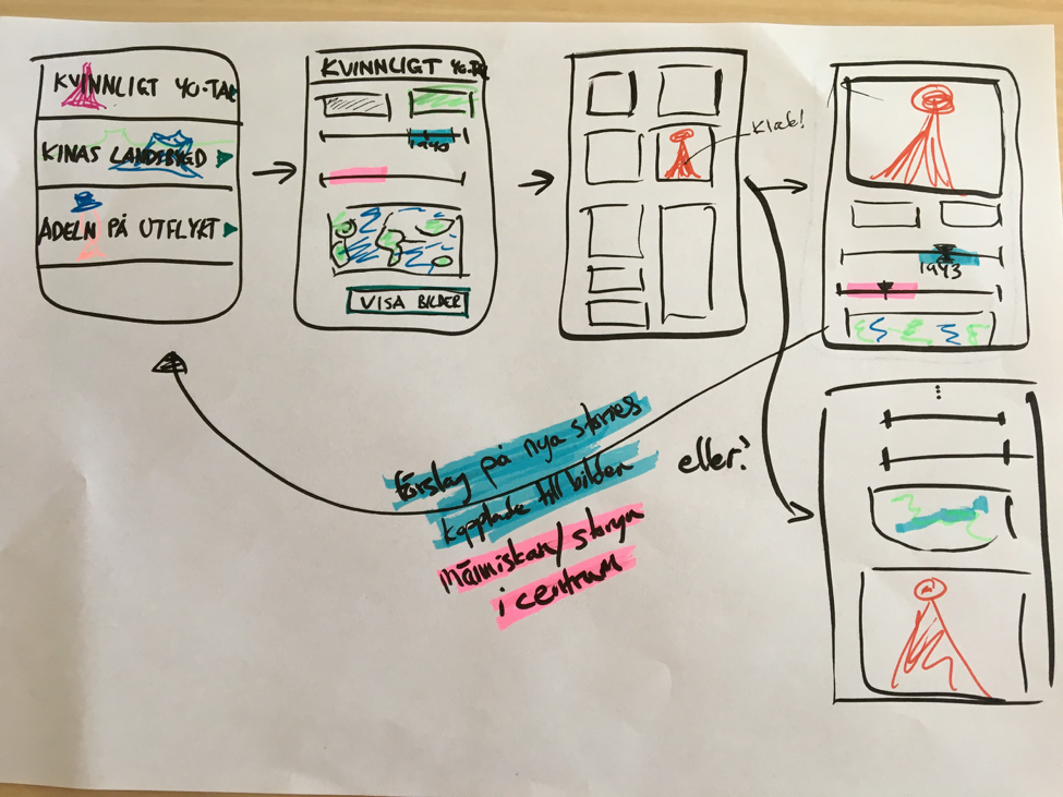
Figure 2: One of dozens of early sketches from the first design sprint
In order to learn from others, we performed user tests and heuristic evaluations of three collections exploration interfaces developed by others. The three were Art Palette, Barnes Collections, and COINS.
We developed/had developed four generous interfaces prototypes and performed user tests and heuristic evaluations of them. Two were based on existing frameworks, the VIKUS Viewer and the German Digital Library Visualized and two were developed from scratch. The prototypes we developed are (in order of development):
The source code for all four is open and available on GitHub.
Were we able to answer the questions that we set out to answer? We think so.
The results of our user tests confirm that users matching the behaviour of the inspiration seeking digital flaneur do indeed enjoy generous interfaces, find them inspirational and conducive to serendipitous discoveries. It should be noted though that with the flaneur the generous interfaces come with a steeper learning curve compared to search-oriented interfaces. The reason simply being that they tend to be more unconventional. A contributing factor to the steeper learning curve is also that many generous interfaces are prototype in nature and often have a number of usability issues.
If you already have a delivery mechanism for your digital collection (API or data dumps) then building a generous online collections experience is most certainly feasible to do in 6-12 months of iterative development.
The greatest challenge is not technical but to systematically learn your intended users needs and match them with whole or curated parts of your collection. You will need a cross-disciplinary team that, besides software/web developers, includes UX design and collections specialists and has the trust of an internal sponsor/champion who knows not to micro-manage.
You will likely also find that you will need to complement or wrangle your existing metadata e.g. add more folksonomic style tags, extract colours, or normalise dates. The typical metadata created during cataloguing, aiming primarily to make internal collections more efficient, is often not wellsuited to support the curiosity-driven exploration of the flaneur.
There’s no “one size fits all”-way to design a generous interface - at the heart of the very concept is that they should be intimately connected to the very nature of the collection they’re exploring. This means that creating generous interfaces is more bespoke than search. . Bespoke development requires money, or an in-house design and development team and that is something that most cultural organisations don’t have. Or rather, they prioritise elsewhere and frequently decide to live with the search interface for their collections that comes with the off-the-shelf collection management system they have purchased
In short, a generous interface is to many cultural organisations, perhaps most, a luxury they feel they cannot afford.
The existing open source generous interface libraries and frameworks allow for rapid prototyping but require significant work to become fully production ready. In particular they lack support for mobile devices and have other usability issues. Even so, they can lower costs and speed up adoption. Conceivably, generous interface component widgets could also be offered as software services that once configured can be embedded on any website.
Another way to speed up adoption is to convince vendors to bundle configurable and skinnable generous interfaces as part of their collection management systems. Or at least add generous interface style aspects to their search-oriented interfaces. The latter is also increasingly common, many search-oriented collection interfaces today offer complementary browse-oriented entrance points to the collection.
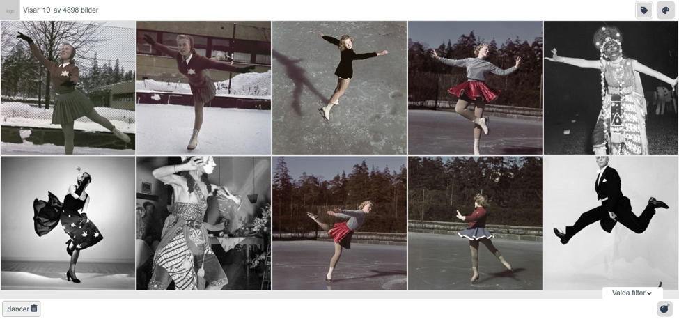
When developing our “colours and tags”-prototype we included collections data from multiple museums. These museums used different keywords for their tags making it difficult to base the exploration on them. Also, the keywords were institutional in style and not as folksonomic as we predicted our selected users to prefer. So we decided, since we were already using Google Vision to extract colours, to also use it to create tags across the collections images.
This taught us that for non-specialist audiences computer vision created tags is a viable option to increase discoverability. The very imprecision of some of the tags created actually helped support serendipitous discoveries: “That’s actually not an embroidery but I really like it!”. There’s great potential in this that could and should be explored for its own sake.
The evaluation was carried out by the Swedish National Heritage Board, Nordiska museet, Nationalmuseum, Malmö museer, and the Swedish Museums of World Cultures with Martin Törnros/Interaktiva rum as supporting freelancer. Olivia Vane and Delorean were contracted to develop one generous interface each.