Taking design lessons from the Rijksmuseum
In April of this year, a major event in the cultural life of the Netherlands took place - the Rijksmuseum in Amsterdam reopened after more than a decade of renovation and reconstruction. The Rijksmuseum boasts one of the most monumental art collections in the world, but I don't want to talk about that! In this blog I want to talk about the building itself, its long history, and in particular the fascinating renovation process that has just been completed.
The Rijksmuseum was designed by the famous and prolific Dutch architect Pierre Cuypers and opened to public in 1885. Cuypers’ original design is considered an architectural gem due to the clear relation of structure and function, the unique combination of different architectural styles, and the many innovative solutions, such as the underpass that went through the building from the north to south side. However, from its very inception, the building faced problems. Cuypers’ plan to position two entrances in the underpass was abandoned because of pressure from Amsterdam City Council which insisted on the entrances being located on the northern side of the building.

'Portret van P.J.H. Cuypers', Rijksmuseum, public domain
This wasn't the only deviation from the original design. Right up until it closed for renovation in 2003, the building had been continuously undergoing changes - new internal and external additions were introduced, spaces were filled in and internal layouts were altered. The building has always been a 'work-in-progress' - something that has done no good for the museum's image.
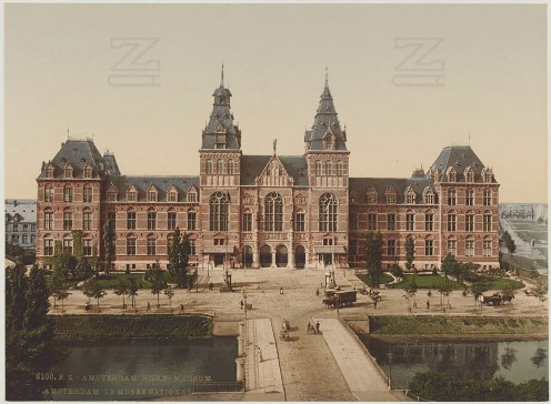
'Amsterdam, Rijks-Museum', Zentralbibliothek Zürich and The European Library, CC0
The building acquired a reputation for being unfriendly on the outside and extremely complicated on the inside. The decision to locate entrances outside the underpass resulted in generations of faithful visitors queuing outside at the mercy of the not always merciful Amsterdam weather. After the inner courtyards, designed by Cuypers as the ‘lungs of the museum' providing it with space and air, were filled in, it became notoriously difficult to find one’s way even to the most famous Dutch paintings, let alone to the ‘ordinary’ collections. One of the museum directors himself verified this by following an occasional visitor, reaching the sad conclusion that the quickest way to get to Vermeers was to have a personal guide. According to the chief architect, the need to make the museum more organised and easier to understand became clear to everyone by the beginning of the new century. The gradual uncontrolled deviation from the original Cuypers’ design finally brought about the need for a total renovation of the Rijksmuseum.
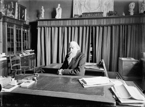
'Portret van architect Pierre (dr. P.J.M.) Cuypers', Rijksdienst voor het Cultureel Erfgoed and CARARE, CC-BY-SA
Running an art institution of the scale of a national museum, like the Rijksmuseum, is a tremendously complex venture, for which the demands of many must be satisfied: the public, national authorities, local authorities, art community, media. And all this should be done within one edifice with its own original design reflecting the creator’s vision as well as the mundane and practical needs of a public building, its entrances, exits and restrooms. From my first visit to the reopened Rijksmuseum, I believe it has finally achieved it.
So, what can we learn from this process? The craft of managing digital cultural collections is relatively young, but as everything digital it develops fast. It is too early to draw across-the-board comparisons between institutions caring for digital collections, like Europeana, and pantheons of national art like the Rijksmuseum. But some concrete parallels do exist and the digital should learn its lessons from the non-digital. A digital collection must be curated, organised, annotated and presented to a visitor just like a 'real life' one. Overloaded museum halls, like the ones seen in the Rijksmuseum before the renovation, are as poor an experience for a museum visitor as crowded web pages are for a website user. Inconvenient orientation in a museum space undermines the ability of the visitor to appreciate the richness of its collection in the same way as poorly designed navigation across a website runs the risk that some important materials will not be found. A clear design of a museum interior with its halls and corridors is as important as a clear design of a website with its individual pages and links.
In Europeana, we host an impressive collection of 27 million cultural objects but we try to be sensitive to the importance of clearly designed halls and passages of our museum. A new design was recently rolled out and more improvements are under way. We hold evaluations by end-user groups to get a feeling of how a visitor feels in our virtual space. We are aware that it is probably a never-ending process; the good news is that changing a layout of a web page is much quicker than doing construction work in a museum. And we can always call by at the renovated Rijksmuseum for some inspiration!