Looking behind the Scenes of Creating a Visual Identity for Europeana Creative
To communicate the outcomes, progress and achievements of the Europeana Creative project online and in print requires an elaborate strategy and some experienced minds. This is where Spild af Tid is brought into play. Spild af Tid is a Copenhagen-based design and illustration studio working across visual media. We asked Christina Holm from Spild af Tid questions about their work, so keep on reading to know more about Spild af Tid and their involvement in Europeana Creative.
Who is Spild af Tid and what is Spild af Tid’s role in Europeana Creative?
We have a multidisciplinary approach to design and do interactive, spatial, digital and classic printed works for a variety of clients: TV and cinema title sequences, illustrations, interactive installations, production design, apps, books, exhibition design, visual identities, video design, posters, campaign films, websites and music videos.
Our participation in the Europeana Creative project is multidisciplinary as well. So far we have been responsible for developing the visual identity for Europeana Creative and designing a variety of digital and printed dissemination material. Graphic designer Laura and project manager Christina are the primary people running this task – with Jakob on the side as the creative director.

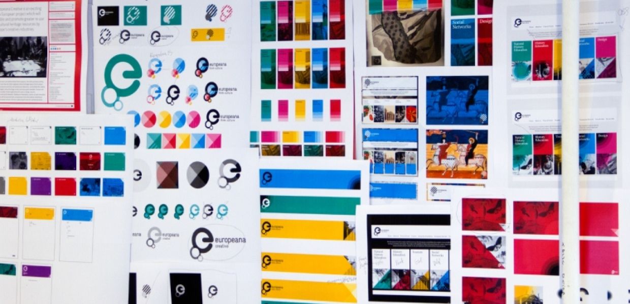
Visual identity of Europeana Creative (photo: Spild af Tid)
In 2014 and 2015 we are going to play a significant role in the development of the design pilot application. Additionally we are in close dialogue with the project team of the tourism pilot application as design partner.

Christina and Laura at work (photo: Spild af Tid)
Why are collaborations with cultural heritage institutions interesting for you as graphic designers?
Cultural heritage institutions represent a large part of our client portfolio. As a designer, working on an assignment for a cultural heritage institution is usually considered a prestige project because of the potentials of working very innovatively and at a high level of creativity. At least this is our experience based on more than ten years of work with cultural heritage institutions.
An eminent example would be our collaboration with the Museum of Copenhagen on The Wall, a huge interactive multi-touch installation providing people to navigate in space and time in a three-dimensional collage of Copenhagen, based on the photo collection of the museum. Additionally, The Wall allows users to be co-producers of the city space installation by contributing their own images, film and comments. From the very beginning, the museum’s level of ambition of this loosely defined idea was extremely high. How to realise the idea became the main challenge, though during the two-year long process the level of ambition was never being compromised. The Wall has been awarded several prestigious prizes and is today one of our main flagship cases.
Within our industry it is well known that working for cultural heritage institutions does not make you rich. The budgets are usually low compared to the effort of work, so the motivation should never be profit. Also the decision-making is definitely not the smoothest part of the project. You really have to be passionate about the design solution itself and enjoy the privilege of working closely together with cultural heritage institutions.
How did you create the visual identity of Europeana Creative?
From a brand strategic perspective one of the key thoughts, when starting up the design project, was to develop a sub-identity closely related to the master identity (the Europeana Brand Guidelines). We decided to unfold the beautiful selection of Europeana imagery in a more contemporary and explicit way. Also the bright Europeana colours could be used more actively in order to create an appealing visual language when communicating to the audiences.
So when starting up the design project, we knew which identity elements to use: logo, typographies, colours. The image part became the most interesting element to work with, as we discovered something amazing was happening when adding colour layers to the cultural heritage image material. And when focusing on unfolding the images and making it a significant identity element, it made really good sense to simplify the logo. We tinted the logo to achieve a floating, light and contemporary visual expression, and it also became a tool to clarify the basic idea of the Europeana logo which is formed from the combination of thought bubbles as a symbol of generating new ideas. This is indeed an essential key message to the Europeana Creative target groups according to the mission statement for the project as a whole: to encourage creative re-use of culture.

Designing the Europeana Creative logo (photo: Spild af Tid)
All in all, by re-using the existing Europeana identity elements in new, creatively appealing ways we felt very loyal to the overall idea about "re-use". We went further and developed an entire new graphic element based on layers of images, patterns, colours and tints: the prism.

Working on the prism (photo: Spild af Tid)
The concept of patterns and creating layers of graphic elements is already widely used in the Europeana identity, though the shape and composition of the prism added a highly contemporary and significant twist to the design. At the same time, the prism is a metaphor for adding new perspectives on given topics and creating different layers of interpretations – an ideal message to the target audiences.
As you might all have noticed already, we chose the "raspberry red" to be the Europeana Creative colour. There is simply something special about the colour pink. When merging it with a spectacular pattern image from 1820 by K. M. Sternberg from the National Museum in Prague, it added to the colour a substantial visual expression and we fell in love right away. Functionally, the raspberry red acts as the primary colour in a colour hierarchy for strong identification across online and offline media.
The main practical challenge was to find a variety of old and new material and to obtain high-resolution, rights-cleared versions. The visual identity has been met really positively among the other partners in Europeana Creative which is absolutely great.

K. M. Sternberg, Versuch einer geognostisch-botanischen Darstellung der Flora der Vorwelt, 1820
(National Museum, Prague)