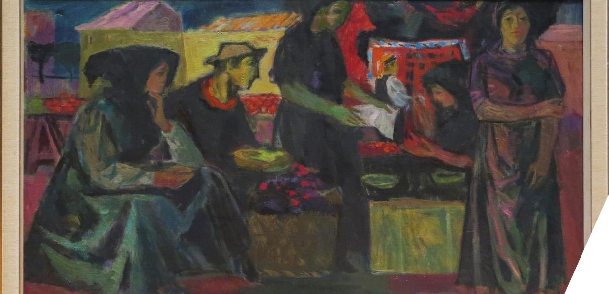
I began my internship with the Service Experience team in February. During my internship, which was part of my Master's student programme of Digital Humanities at KU Leuven, I built on Europeana's previous research to examine the needs, motivations and experience of people using the website. I decided to invite eight visitors for a more in-depth study, aiming to learn more about their needs, experience with the website, and their suggestions for improving it. I chose to work with people with visual impairments because I believe that providing solutions accessible for this group would help not only people with disabilities, but everyone using the website. Data from this research filled in some of the gaps in the previous quantitative research.
How I approached my user experience research
’User experience research’ refers to the different methods used to examine an individual’s experience of a digital product. It can be either qualitative or quantitative, but in this case, we chose an approach that was more in-depth, and developed for a smaller sample size. My research method consisted of an interview combined with usability testing (where we ask someone to complete a series of tasks to help us determine the usefulness and accessibility of the website). These results are qualitative, which means that they do not deal with quantity (numbers) but rather with qualities or characteristics. Due to its depth the qualitative data is usually based on the smaller sample size so the results should not be extrapolated.
For my research, I spoke to eight participants between 22 and 74 years of age who had various levels of visual impairment and education. In our one hour conversation, I asked them questions about their lives, habits, and affinity with art. Afterward, I asked them to perform certain tasks on the website and then share their opinion. These tasks included reading a blog post and filtering the search results, navigating through the website, and interacting with various content and functionalities presented to them. I collected raw data in the form of notes and recordings.
My findings
Following the collection of data, we conducted a thematic analysis to group certain themes into patterns. Based on the analysis, we learned why certain functions are not as accessible as they should be. Even though the interviewees were enthusiastic about the website, they still experienced some difficulties using it.
Participants felt that Europeana needs to offer a high contrast mode function because the third-party extensions do not work well on the website. As an example, one participant found it difficult to navigate the website because, while using an extension, most of the icons blended into the background. ‘Only when I put my mouse over it can I see it’, said one of the participants. Responding to this feedback, I designed a prototype of a dark mode function that was tailored to the website and presented it to participants who found it more accessible. Europeana will explore the feasibility of implementing this feature.
At the time of testing, we also found that the languages in which the website is available could be improved. When participants selected a language other than English, the titles of the articles were translated, but not the actual articles (blog posts and exhibitions.) This caused confusion for those whose first language was not English. One participant said, ‘When you choose the language, all of the content is still in English. Only name categories are in Spanish. It would be more accessible if all the text would be in the selected language’. Europeana is aware of this issue and will continue taking further steps to improve this.
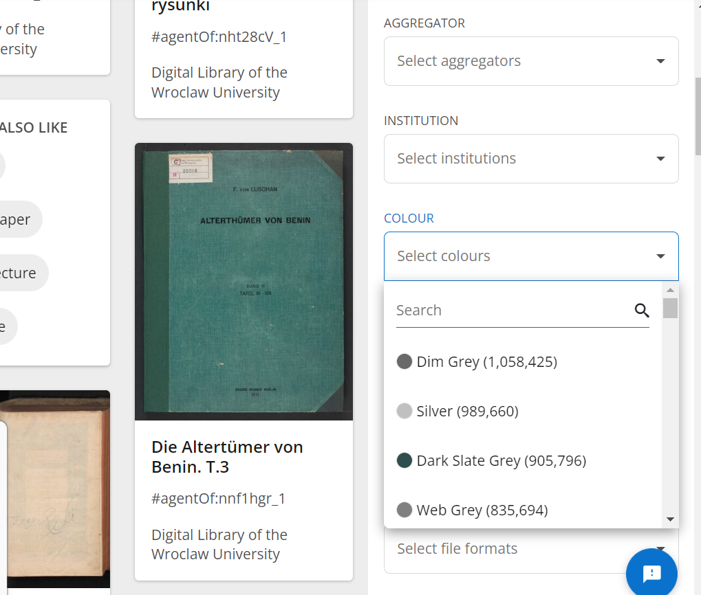
Additionally, the colour filter on the search page (see the image below) caused some confusion. In general, participants liked the names of colors calling them ‘evocative’ and saying that they can picture what the color looks like from the names. However, some names were confusing. One of the participants said: ‘I don't know what the difference is between sea shine and antique white, mint cream, and honeydew. These colors look the same to me.’ Furthermore, they wanted to introduce a few simple colors among the more complex ones to appeal to an audience that may be less familiar with them. Europeana will look into this.