This website uses cookies to ensure you get the best experience. By clicking or navigating the site you agree to allow our collection of information through cookies. Check our Privacy policy.

2 minutes to read Posted on Tuesday November 10, 2020

Updated on Monday November 6, 2023

Exploring Europeana's approach to design

This November on Pro, we share the practices we follow when developing the Europeana website to ensure that people have a positive experience browsing millions of cultural heritage objects. In this post, we look at how we prioritise what to design, our approach to user experience and visual design, and the practices we put in place to ensure the best experience for our users. 

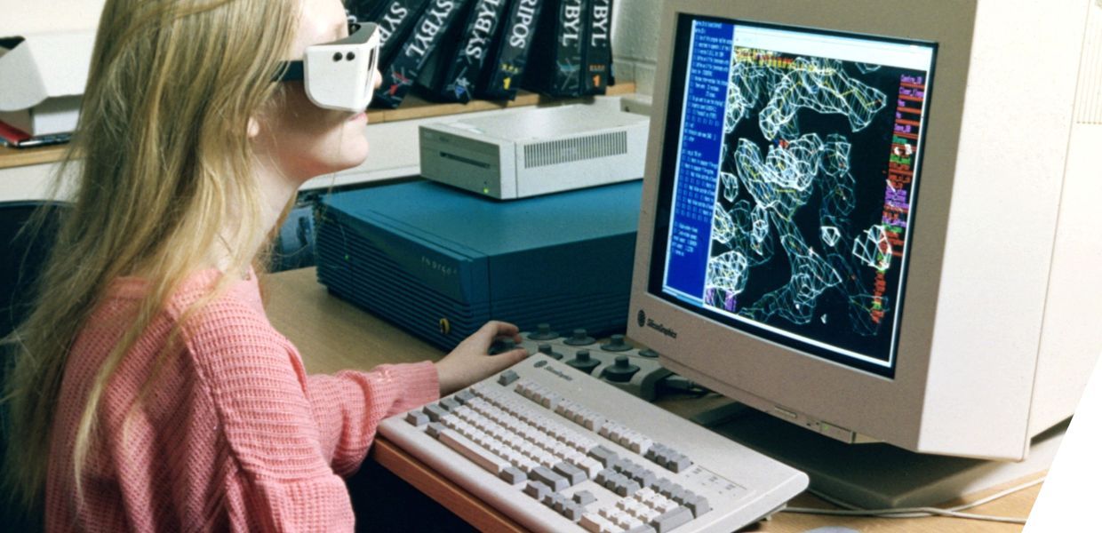
A girl with a VR headset on sat in front of a computer which shows 3D proteins
Title:
3D modelling of proteins on computer
Institution:
Wellcome Collection
Country:
United Kingdom

The importance of design 

Design as a discipline takes into consideration many factors and aspects to ensure the best outcome of a product, service, brand or communication material. It’s an integral part of any creative workflow and development process, as it gives foresight of the final product, predicts or flags challenges and bottlenecks and consolidates ideas across teams and organisations. 

At Europeana, our design approach is human-centric, particularly when it comes to user experience. We make sure that the output in our products serves our audiences in the best way possible. This ensures that they can be used by a wide variety of people.

Designing an online experience for cultural heritage collections

A website experience is fully designed even before development work starts, underpinning the project and giving its first (primitive) appearance. The new Europeana website was no exception. We designed three main ‘flows’ for users to help them to engage with the website and the cultural heritage items it highlights:

  • Discovery by browsing: we designed the website to ensure that our general audience could engage with and explore the huge amount of interesting content in our collections through suggesting ‘related collections’ to encourage browsing.
Title:
Screenshot of related collections suggested to someone searching 'vessels': 'ship'', 'container ship', 'drinking vessel' and 'Vincent Vessel' are suggested
Date:
2020
  • Entity based search: we offer people the option to explore our collections by subject, profession and time frame, allowing them to immerse themselves in a particular area and see not only the sheer number of content available, but also surprising connections between items.
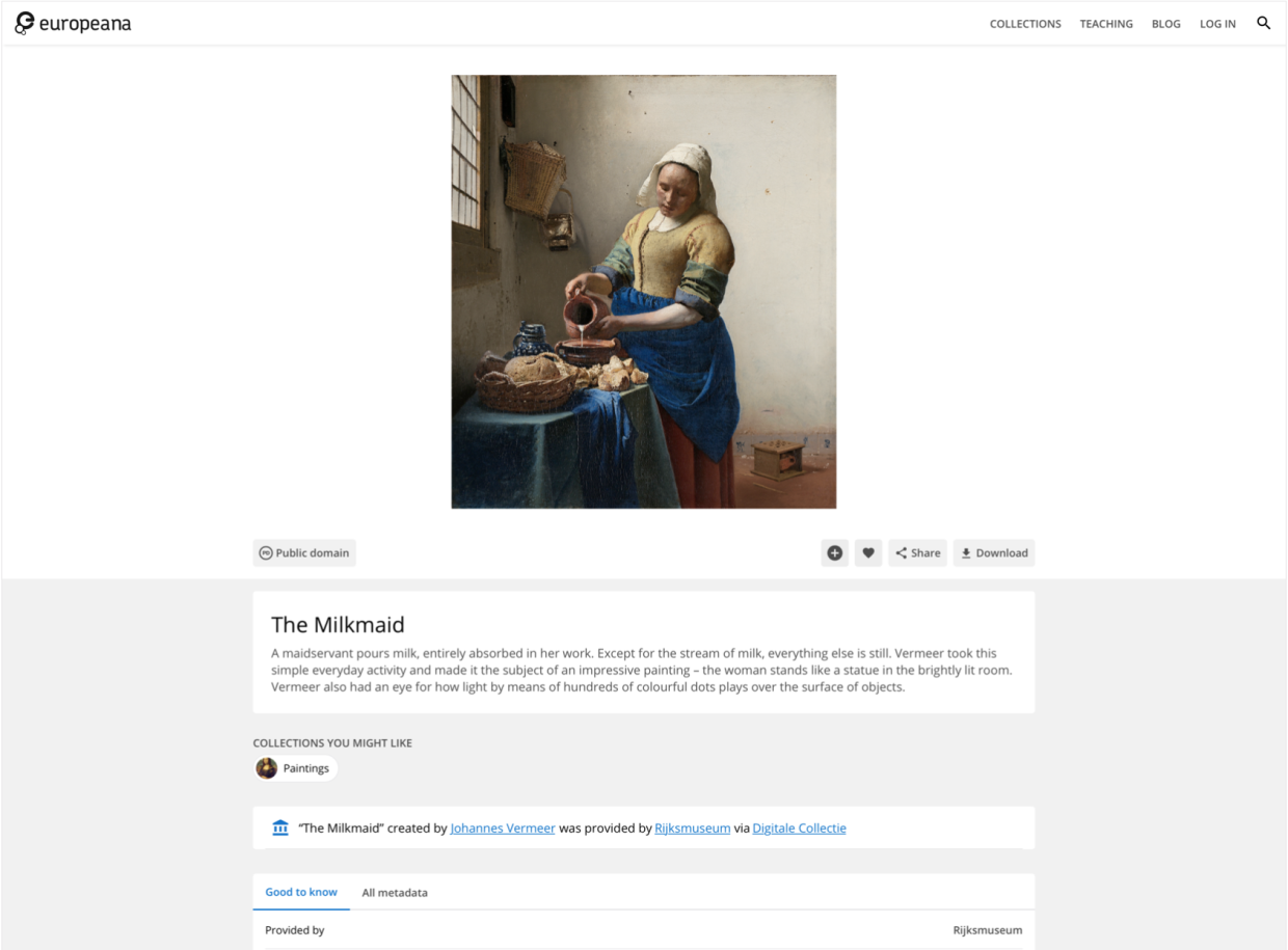
  • Item page: individual item pages are historically our most popular pages, and for most users a gateway to our collections. So we are particularly focused on providing the best experience on these pages by highlighting the media of the object and providing essential information and comprehensive metadata in a seamless and intuitive way.
Title:
A screenshot of 'The Milkmaid' individual item page on the Europeana collections website

Accessibility is also taken into consideration from the beginning in our designs, so that the experience is enjoyable for all, including people with any type of temporary or permanent disability. For a more in depth look at how we address accessibility read our post on that topic

Best practices 

One main framework we use to design our products is Material Design, a design language developed by Google. It provides a good framework for easy to use elements (such as buttons or font-sizes) and patterns with accessibility already factored in, which simplifies our workflow. Additionally, developers can easily implement its components, reducing implementation time and facilitating new iterations.

With a constant need to improve and enhance our user experience, we research new trends and approaches that materialise in constant iterations of elements, sections and features of our website(s).

Title:
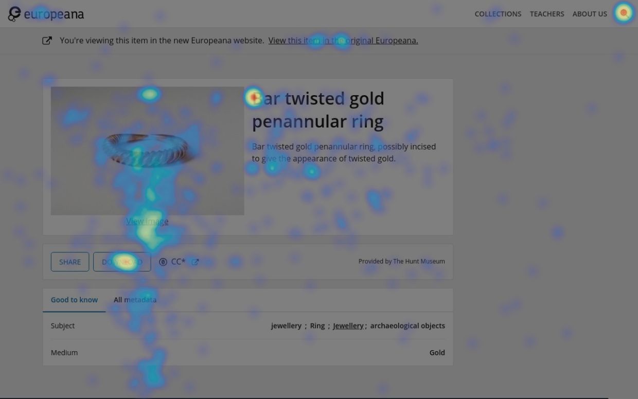
Heatmap tool tracking clicks on an item page, with redder colours being the most clicked

By getting data from real users we can pinpoint areas that we should improve. We analyse information from a variety of sources and make decisions based on hard data rather than assumptions and second-guessing. For example, we track clicks on our pages to understand the areas that have more engagement, and if those match the elements we want to give prominence. If that’s not happening then we’ll iterate the design and retest it. Internal stakeholder feedback is also factored in, adding to the wide variety of input we are able to draw information from, and translating into more inclusive and representative decisions.

Designing a product is an organic process that has a clear start but never ends, with additional requirements, improvements and fixes. There's always a chance to tinker and improve or add something to the original design. Iteration is the natural process of improving and building upon a robust and flexible design, adjusting it to an ever-changing world with new requirements, needs and styles. 

Get involved

We are always looking for people who are willing to participate in testing the new features of the Europeana website. If you would like to be contacted when we organise the next round of testing, please email Dasha Moskalenko at [email protected].

top