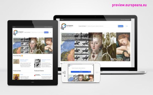
Europeana - New Portal and Infrastructure
Today, we are pleased to launch the preview of the new Europeana technical infrastructure. This preview will last for about 6-8 weeks as we stabilise and optimise the technology and models behind it. We'll keep the current Europeana infrastructure going during this time in order to provide full redundancy. The most visible part of this new infrastructure is, of course, the portal, but in truth, that's just the tip of the iceberg.

The new infrastructure comprises three main components:
- An updated United Ingestion Manager which uses the MINT-tool for mapping original metadata to the Europeana Data Model (EDM).
- A new core system with components for storage and indexing; and a new API that uses this new storage/indexing model.
- A new mobile and tablet-friendly portal serving metadata modelled in EDM.
In this blog, I'll focus on providing some more detail about the new portal. We'll return to the other components in future blog posts. Look out for a blog about the new API very soon!
There are basically two principles that underpin the new design: 1. Treat all users the same and 2. Show don't tell.
Treat all users the same
In the current Europeana portal, users of mobile phones are directed to a mobile-specific version of the portal, in which functionality is limited. For example, a mobile user can't filter search results via facets or see all the metadata for the items they're looking at. The new portal is developed according to the responsive design methodology where a fluid grid and media queries adapt the layout and media size to devices with differently sized screens. The content and functionality, though, stays the same and so all users, irrespective of device, are able to access all the metadata for all items and have access to all functionalities. Note also that all image carousels and slide-shows will respond to swipe control.
Show don't tell
In our latest update of the portal design (October 2011), we made the user interface more visual. We started showing with images rather than just telling with links. This has proved to be successful and so we're further reinforcing that success in the new portal. One example is that featured exhibitions, blog posts, items and partners on the landing page are displayed with a combination of images and text. Indeed, the Featured Partner component is entirely new and we hope it will help our users discover collections and Europeana Network members they didn't know they were missing!
Another example of Show don't tell is that in the object display of the new portal we show similar items and canned search links (the auto-suggested 'Search also for' links) more prominently in order to encourage the user to explore the content further.
Did I mention EDM?
As mentioned at the start of this post, the portal is just the tip of the iceberg. Under the hood, the metadata it displays is now modelled in EDM. To have a peek at the underlying metadata just add '&format=labels' to the end of any portal URL and voilà!
During the preview period, we will regularly request feedback from all our users. Don't hesitate to give us yours! More information on our end-user blog.
