Tickets page
If purchasing tickets is the main thing you would like visitors to do, invest some time in setting it up so it works smoothly. Can a visitor easily access this page, ideally without making an account or logging in? Can they easily choose the type of ticket they need, select a date to visit, and then pay all in one go? Do they receive a confirmation email with their tickets, which they can easily access on the day they visit? The fewer and smoother these steps are, the more likely it is that your visitors will be able to accomplish this important action.
Collections page
Encouraging visitors to access and explore your collections online may also be an important action if they are digitised (discover some of the benefits).
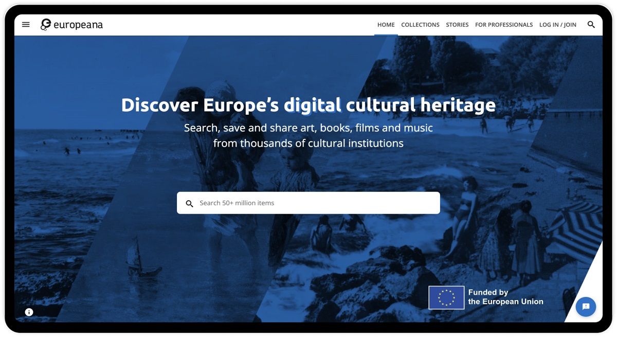
Due to the size of the datasets associated with digital collections, it’s not always easy for a simple CMS website to support them. This is one of the reasons why thousands of cultural heritage institutions across Europe have chosen to share their digital collections in collaboration with the Europeana Initiative. Data specialists in the Europeana Aggregators’ Forum support the digitisation of collections, so that they can be packaged into datasets and shared on Europeana.eu alongside collections from thousands of institutions across Europe.
On your Collections page, it’s helpful to allow a search option and search filters to narrow your visitors’ search when looking for specific items. Most online visitors tend to have one of two goals: general exploration or searching for a specific item.
How can you help people explore your collections?
- Showcase your masterpieces or well-known items at the top of the page, or on the first page of the collection.
- Invest in unique digital experiences such as this 3D exploration of the Castillo Alcalá de Xivert site, provided by the Asociación para la Documentación y Divulgación 4D.
How can you help people search for specific items?
- Include a search bar.
- Include basic search filters such as media type, file type and media quality.
Interested in web design for cultural collections? Read this study (in Dutch).
Exhibitions page
This page showcases what is currently ‘on’ at the institution. If you like, you can link to separate pages for each exhibition. Keep in mind that a web audience may have a shorter attention span for information than an in-person audience. Expect people to spend under one minute per page, so keep the key information about exhibitions near the top. Lower on the page, you can include more content which is beneficial for search engine optimisation (SEO). This will help your site become findable on search engines such as Google. Look up which SEO keywords are most important for your institution’s particular field and be sure to use those in your written content (this article contains suggestions for how to do this, and other SEO tips).
Events page with a calendar
This is a great page to include if your institution has ongoing events and the resources to maintain the calendar. Avoid having an unmaintained or empty calendar.
About us
This page allows you to share your institution’s background, mission and values. Keep in mind that you are speaking to a potentially wider audience than the one that visits in-person.
Contact
This page houses vital information such as a contact form and/or email address, physical address, physical accessibility information, and a map of the building. If you include a contact form, ensure that it links to an easily accessible email inbox at your institution - and that someone will regularly check it and respond to messages.
What site navigation should you use?
Reserve your top-level navigation bar for the pages that help your audience the most: Tickets, Collections, Exhibitions, Contact, Events (if applicable), and About Us. Use the footer for links to additional pages such as Terms and Conditions, Privacy Policy and Job Openings.
Find out more
If you enjoyed this post, look out for the next in the series:understanding your web audience. Now that you have some information to get you started with building your basic website, in the next post we’ll look at how to create the best experience for your online audience.
You can also read about the practices we follow at Europeana for website development, including our development processes, best practices, and tools we use to ensure our application is robust and resilient.


