Website usability examined by Europeana Newspapers project
Blog by Friedel Grant, Communications Officer, LIBER.
Over the past few months, the Europeana Newspapers project has been working to build an online browser that will display digital versions of historic newspapers. This tool aims to provide a simple yet effective way to search the 18 million digital newspaper pages that Europeana Newspapers will make available through Europeana and The European Library.
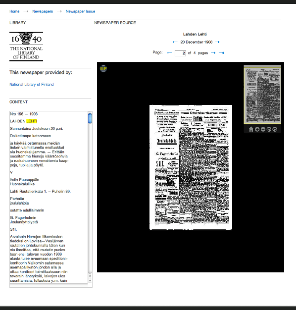
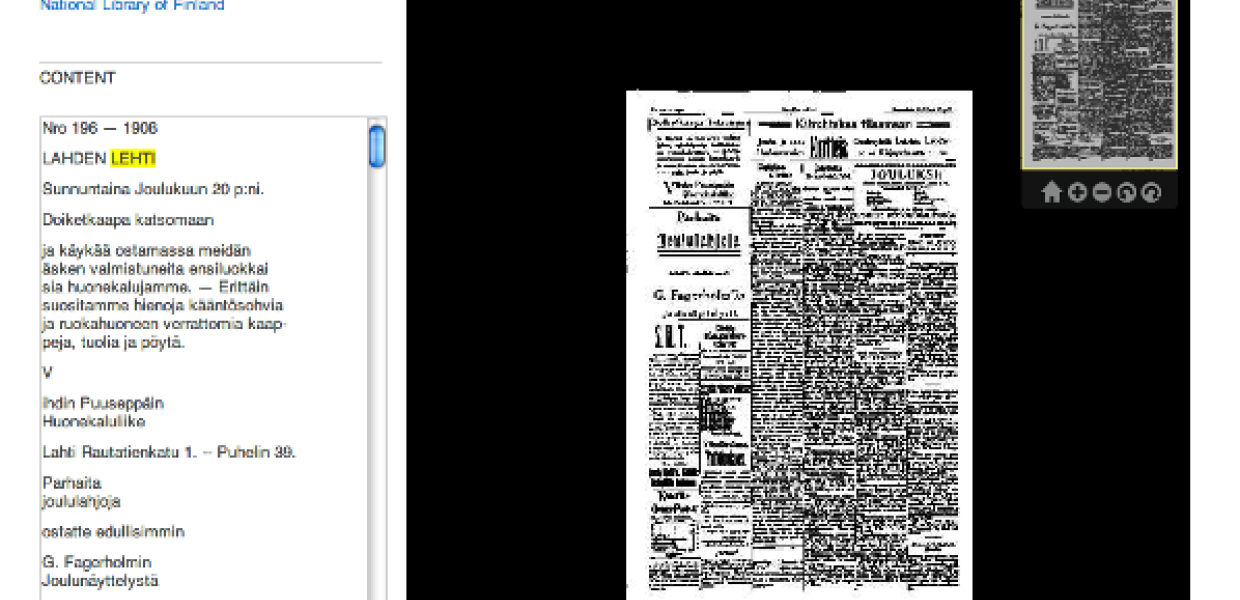
Screenshot from The European Library's newspaper browser - currently in development
Usability testing is obviously a key part of this work. That’s why the most recent Europeana Newspapers workshop in Amsterdam (held as part of The European Library’s annual conference) focused on what works and what doesn’t when presenting newspaper content online.
The session started with an overview of some key usability principles, as outlined by Channa Veldhuijsen, a specialist in usability testing for the National Library of the Netherlands. Her presentation emphasised the need for repeated user testing, since designers are often unable to spot problems with their own designs.
Channa said: 'All websites have problems and most problems are easy to find, if you try. If you don’t try, your users will tell you about these problems once you have launched the website. It is much easier to fix problems in the early stages of a project and it’s certainly better for your reputation.'

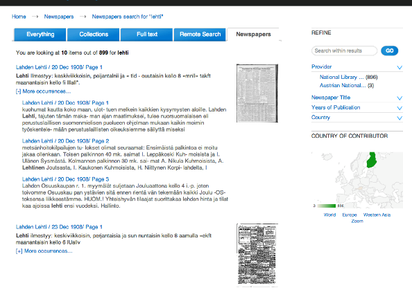
Timarit, the newspaper browser from the National and University Library of Iceland, being presented.
To illustrate various usability principles, the session then turned to the new browser being developed by The European Library and the existing newspaper browsers of several major libraries across Europe:
- DDR Presse (Berlin State Library)
- British Newspaper Archive (British Library)
- dLib.si (National and University Library of Slovenia)
- Timarit.is (National and University Library of Iceland)
- eLuxemburgensia (National Library of Luxembourg)
- Kramerius 3 (National Library of Czech Republic)
Screenshot from The European Library's newspaper browser - currently in development
These sites were presented by the libraries, and then analysed by Dean Birkett, a User Experience Designer at Europeana. His main points included:
- Choose a large font: 16px is the recommended size
- Be careful of colours. Some online newspaper sites use red to highlight important information but red tends to be associated with warning signals and errors in the user’s mind
- Similarly, some colour combinations do not provide enough contrast for those suffering from colour-blindness
- Use words to indicate language choices (e.g. ‘English’, ‘Français’) not flags. The Spanish flag won’t necessarily be interpreted to mean ‘click here for Spanish’ if the user is from Mexico
- Cut down on unnecessary text. Make it easy for users to skim (e.g. through the use of bullet points)
- Be aware of jargon that makes it more difficult for users to understand how something works. If you run a site where users have to pay to view newspapers, for example, don’t refer to ‘credits’ without explaining what a ‘credit’ costs or how many ‘credits’ you need to view one paper.
To learn more about the work of Europeana Newspapers, and to see all the presentations and videos from the workshop, please visit the project website: www.europeana-newspapers.eu