Deciding what to share on Facebook and selecting your best

Europeana Facebook tip 2/5: A series by Wiebe de Jager, Marketing Manager at Europeana
Deciding what to share on social media can be a daunting task. Especially if you’re holding very diverse collections and cater to a diverse audience. But even if you’re in a niche market, it still can be difficult to select the right images to surface via your Facebook page. In this blog post, we’ll give you some examples of images that got lots of traction on social media and briefly explain the mechanisms of the attention economy.
Economy of attention
Every day, we see and are exposed to hundreds or even thousands of images and advertisements, both on and offline. On social media, everyone, it seems, is asking for our attention by sharing images: not only friends, family and acquaintances, but also companies and cultural heritage institutions like your own. As a result, our brain starts to automatically filter the images that are thrown at us. We simply can’t notice, absorb, or even judge the personal merit of all these daily visual attacks.
Therefore, don’t assume that people will notice each image that you post. Only the most beautiful, engaging, provoking or emotional images will stand out from the noise. From our experience, images that provoke an immediate emotion work best in terms of reach and engagement. From working with Retronaut we learned that images that meet the S.P.E.E.D criteria work best:

Let’s not go into the details here; our upcoming paper on the S.P.E.E.D. model will elaborate on the criteria and explain each factor in detail. For now, let’s focus on the ‘disruption’ element, as we believe that this is the most important factor behind engagement and reach.
Disruptive images are the exceptions, the anomalies, the weird finds. A picture that does not fit with our mental map of history or the world around us will bring us briefly to a halt. By surfacing a disruptive image, we can set ourselves briefly apart from the noise, and in turn be rewarded by the attention from our audience.
Example 1: 1930s nose jobs
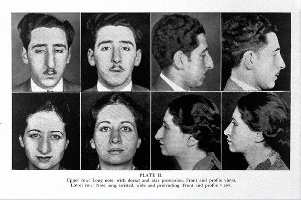
One example of such a disruptive image is ‘1930s nosejobs’. Not many people know that already in the 1930s, plastic surgery was thriving, as a direct result of the First World War. Many soldiers got face injuries as a result of the trench war. Surgeons gained lots of experience with facial reconstruction and began to apply their knowledge in cosmetic surgery. The image below was selected for its disruptive content and surfaced via Europeana’s blog:

J. Sheehan, Plastic Surgery of the Nose. CC-BY The Wellcome Library.
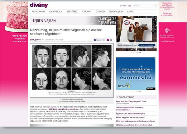
After this image was highlighted via social media, it was shared and liked by thousands of people. Eventually, the mainstream media picked it up and the image was featured on dívány, one of Hungary’s premier news sites:

Credit: Divany
As a result of sharing this one image, for weeks ‘plastic surgery’ was the most entered search query on Europeana.eu. Interest in the Wellcome Library collection increased by 17,000%, generating 57,000 views of individual records.
Example 2: the ‘pig rider’

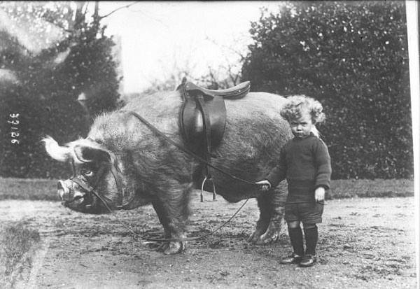
Credit: Animaux apprivoisés de Mr Wingfield à Ampthill. National Library of France, Public Domain marked.
The ‘Pig rider’ image is probably Europeana’s most shared image ever: after surfacing it via Retronaut, the image got 1,900 likes and 1,500 re-shares on Facebook, resulting in 250,000 impressions, reaching over 100,000 unique users. Just one image did that! The image now even appears in Google’s top image results if you search for ‘pig rider’.
Of course, you might not have pictures of 1930s nose jobs or kid pig riders in your collections. But in every collection, you’ll have remarkable items. Or remarkable details; zooming in can sometimes help you with identifying the peculiar details in otherwise ordinary objects.
Images or photos?
Then there is the question of what kind of material to share. In August 2014, Socialbakers reported that 87% of the most engaging posts on Facebook were photos. Their data shows that only 4% of the most engaging content on Facebook is generated by links, another 3% by videos, and 2% by text-only status updates.
It’s perhaps not a complete surprise that photos work best on a social medium. Human beings are attracted most to what they recognise and relate to. But that doesn’t mean that all photos are fit for sharing via social media. So, what not to post?
- images of your institute’s building (unless it’s a work of art itself)
- thumbnail images, or photos of poor quality
- photos with watermarks on it
- photos of people in a meeting or conference
Timing
Besides the content itself, timing of your posts is an essential element of a successful Facebook publishing strategy. This is the subject of the next blogpost in the series.
